Evolution of Design
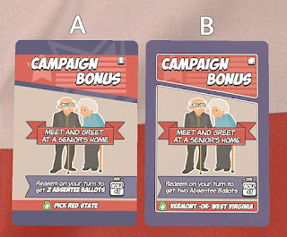
The design process is iterative. I try something new, test it, receive feedback, and then improve the design. After going through this process many times it is fun to look back on previous designs to see where you started from. Let's look back on one specific card: Large Rally Campaign Bonus. Version 5 Here is one of the first versions. The design was set by the artist that I hired on Fiverr. The original card was designed for the characters. I took that as a template and built it out for the Campaign cards. The background image I got from a stock photo website to which I have a subscription. The top Roll +1 and title are a different font than the flavor text or mechanic text. Version 7 Here we move the Roll +1 symbol down to the bottom-right corner where it will stay throughout all designs. I was not happy with the separator, but it was good enough to test out. The background stayed gray and muted so as not to distract from the text on the card. I later decided agains...


